Compass Control
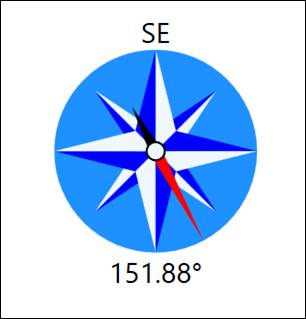
The compass control is meant for use in indicating direction, primarily wind direction as measured by a wind vane / windsock. The control expects a tag in degrees (0 – 360) and the red needle will point in the indicated direction. The label at the top of the control will change to the general area the needle is pointing at.
Most of the colors for the control are exposed and can therefore be changed (or alarmed on). The labels at the top and bottom can be removed by setting the NorthLabelFontSize and the NeedlDegreeLabelFontSize properties to zero.
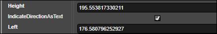
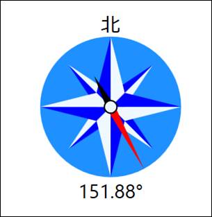
If the top label should just be static, or for localization purposes the value can be fixed by unchecking the IndicateDirectionAsText property:
If this case, the label at the top will not change based on needle value. The default label is “N” but this can be overridden to anything in the NorthLabelFallbackText property. This can be useful for cultures where the default labels will not be meaningful.
There is also a property to set the formatting for the label at the bottom if more/less decimals are needed, or if something besides the degree symbol is desired.
Control Whisker Chart
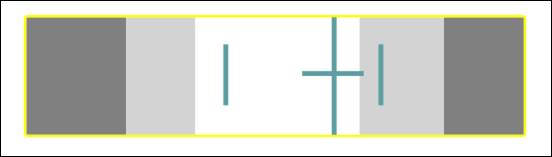
The whisker chart control is intended to be an easy way to visualize the health of a control loop by showing the process value (or average of the process value) relative to the high and high-high as well as the low and low-low limits which are represented by the light grey and dark grey areas. In the picture below the tallest bar in the center is the process value.
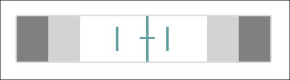
The smaller vertical bars to the left and right of the process value are meant to represent the minimum and maximum values of the process value. The horizontal bar across the process value is meant to represent one standard deviation in either direction, giving an idea at a glance what the process is running at, what the highest and lowest values were, as well as the variability.
The properties to set these values are as follows:
•MainValue
•MainMaximum
•MainMinimum
•MainStdDev
The alarm limits are set with these properties:
•HighAlarmLimit
•HighWarningLimit
•LowAlarmLimit
•LowWarningLimit
When either the MainValue or the MainMaximum or MainMinum values violate the limit settings, the border will change color:
What the color for the warning and the color for the alarm states is configurable. It can also be set to transparent to get rid of it. If the alarm should only trigger on the main value and not the min or max then checking the IgnoreMinMaxForBorderAlarm property will result in only the main value being evaluated.
The whisker control can also be used for more general reporting purposes because all of the lines besides the main value can be hidden if they are not needed. For example, here everything but the main value have been hidden, and the lower warning and alarm sections have been collapsed (by setting them to zero):
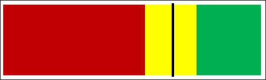
This allows for a gage-like control for a dashboard that could be used to show progress towards a production goal in a similar way to a bullet chart. Note that the upper and lower range values default to 0 to 100, and can be set with the RangeMaximum and RangeMinimum properties.
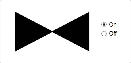
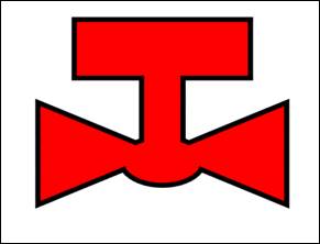
Generic Valve
Then generic valve is meant to make it convenient to display a large number of valves on a PID when the showing the type of valve is not overly important.
The main properties are the OffStateFill, OnStateFill, the RunState and the RunStateThreshold. The fill values determine what color the value changes depending on the state. The RunState is compared against the RunStateThreshold (greater than or equal to) to determine whether it evaluates to On or Off.
If the tag bound to the valve is a text tag the value is instead evaluated against the following values (case-insensitive) to determine if it the state is on:
•ON
•RUN
•RUNNING
•ACTIVE
If none are matched it is assumed to be off. If a valve state tag does not fall in the list of these text values a mapping must be used to convert to a number instead.
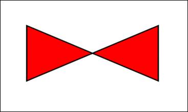
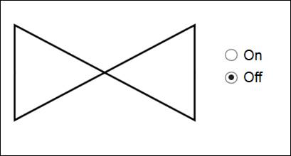
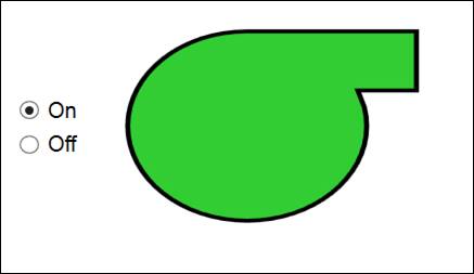
Note – the default colors are Red/Green which can be difficult for those with difficultly distinguishing colors, so an alternative would be Transparent/Black to give something like this when off:
And this when on:
Control Valve
A valve for PID type graphics that indicates a control/globe valve. The control valve is functionally the same as the generic valve.
Switching Valve
A valve for PID type graphics that indicates a switching valve. The switching valve is functionally the same as the generic valve.
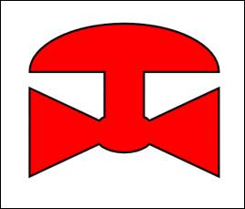
Hollow Pump
A pump/compressor for PID type graphics. The switching valve is functionally the same as the generic valve.
The pump’s center is hollow to allow users to set the typical Red/Green colors for Off/On but still allow users that cannot distinguish the those colors to know what the pump state is by visually changing when in the on state:
Percent Dial
The percent dial is a gage meant primarily for dashboards and mainly for showing values between 0 and 100.
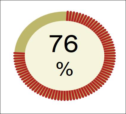
However the range minimum and maximum are adjustable, as are the unit label and the font sizes of the value label and the unit label. In this way process values such as machine speed can also be displayed if desired.
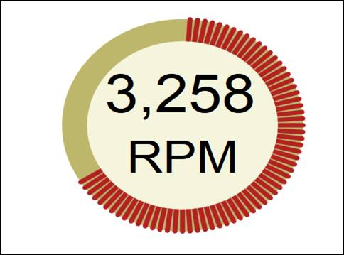
The colors for the labels, the background colors and the color of the lines are all exposed as well. They are TextForeground, BackgroundEllipseFill, and DialLineFill.